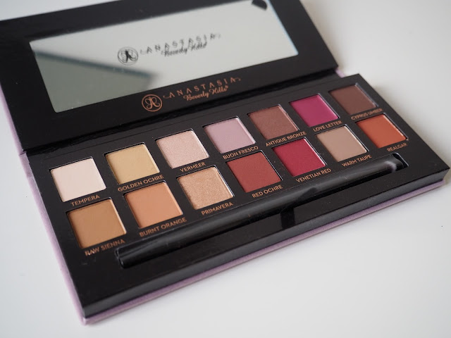
If you're not aware of the brand Anastasia Beverly Hills & who they are, its actually a lady called Anastasia Soares who was orginially from Romania but travelled to LA in the 90's to pursue a career in makeup with the Anastasia Beverly Hills brand. - this brand has infact been around since 1997, but really soared the world a couple of years ago, through celebrities such as the Kardashians raving its products on social media. - when 'contouring' really started to become a thing, so did ABH and their contour palette in both cream, and powder. So obviously when the beautiful 'modern renaissance palette' was released in 14 stunning shades, the whole world went crazy for it. & still is going crazy for it.
PACKAGING
The product is stunning, and if you're a friend of mine you'll be well aware that my favourite colour is mauve just like the palette.. so you could say i'm biased. If i'm going to be horribly picky, I would say using suede/velvet for the packaging is risky, and as soon as you start getting product on it, its never going to be that same fresh clean palette again.. I think they would have benefited more from keeping it bob standard plastic or cardboard, but each to their own and I understand this way it is more luxurious.. and I guess you are paying £41 for it.
It's also worth noting that the brush that comes within the packaging is actually surprisingly very good, i've found with most eyeshadow palettes, particularly urban decay their brushes to be very stiff, and not blendable.. this was however, a pleasant surprise.
FORMULA
FORMULA
i've used the ABH brush to swatch all colours. The product itself is very creamy, which I guess is good for blendibility (is that even a word?) and honestly all shades blend very well together, however i've found an incredible amount of fallout with each colour, which is fine as long as you're doing the rest of your face after applying shadow.. you will definitely need a primer for these eyeshadows as without it the lasting ability isn't amazing.
There are 11 matte shades, and 3 satin shades.
from left to right & down..
first row..
Tempera - velvety beige matte shade, could well be used as a base for product, particularly below the brow bone, to give definition.
Golden Ochre - more of a yellow undertone to Tempera, this could be a great transition colour..
Vermeer - one of my favourite shades of the palette, this iridescent champagne colour is perfect for the inner corners of the eye, and brown bone to give highlight to the areas.
Buon Fresco - the ultimate mauve shade, described as 'antique lavender' this shade is a beautiful ultra matte finish, and I think would be perfect as a subtle day time base.
Antique Bronze - more of your typical warm bronze colour, this metallic shimmer shade is perfect for creating a smokey eye with shine.
Love Letter - i'm very excited about this shade, i've never used such a bold pink before, infact it's probably more raspberry than anything.
Cyprus Umber - dark coffee with an ultra matte finish, this one is the darker of the 14 and I would expect to use it under the waterline or in the outer V when going for a more smokey look.
second row..
second row..
Raw Sienna - neutral amber tone, another beautiful transition colour, more of an undertone/base shade.
Burnt Orange - deep orange with an ultra matte finish, great to deepen the crease
Primavera - another lovely highlight shade, gold dust with a shimmery metallic finish, great for a day look.
Red Ochre - ultra matte red stone finish, this would be lovely with a few browns to create a bold night-time shade.
Venetian Red - one of the boldest, more crimson colour.. this one really stands out as an overall of the palette, however it is probably the least pigmented of them all, you really have to work on this.. I can't see myself using it too much.
Warm Taupe - earth toned grey, i'm quite olive toned so this shade would probably be best used on me as a base/lid shade.
Realgar - brick, with an ultra matte finish.. i'm loving these shades at the moment, the popping orange, seriously brings out your eye colour when applied as a full lid shade, I can imagine i'll be using this loads.
What drew me to this palette initially, apart from the brand & the promise of it being highly pigmented and great quality just from the name.. was the chosen range of colours. I don't actually own a palette that is filled with pinks, taupes & berry shades, nor have I ever created looks with it, so it was very much welcomed into my eyeshadow draw. Do I really need this eyeshadow palette? No, not really. Do I regret buying this palette? Not one bit.
xox


No comments:
Post a Comment